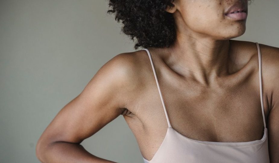
Neutral January Color Palette That Photographs Well
You arrive for a January photo session wearing beige trousers, a cream sweater, and a camel coat. In person, the outfit looks soft and expensive. On camera, it becomes one pale block with no waist, no texture, and no clear focal point.
The common misconception is that neutral colors automatically photograph well. They do not. A neutral outfit needs contrast, visible texture, and enough separation between adjacent shades to keep your face and body readable in cold winter light.
Why do some neutral January outfits look flat in photos?
Camera sensors need tonal separation
Neutral colors photograph well when they create a clear scale from light to dark. A cream top next to oatmeal trousers can look elegant in a mirror, but the two shades may merge under cloudy outdoor light. Add a charcoal coat, dark brown boots, or an ink-navy scarf, and the outfit gains structure without losing its calm mood.
Think in terms of contrast, not just color names. Soft white reflects a lot of light. Charcoal absorbs it. Taupe sits between the two. That range gives a camera enough information to separate the neckline, shoulders, waist, and legs. A useful January outfit usually contains one light neutral, one middle neutral, and one dark anchor.
Texture prevents beige from becoming a blank surface
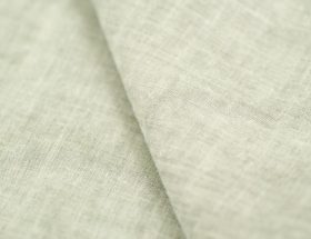
Flat jersey, smooth trousers, and a polished coat can all reflect light in a similar way. The result looks bland even when the colors are technically different. Add one visible surface: ribbed wool, brushed cashmere, corduroy, suede, a quilted bag, or a nubby bouclé scarf.
Texture matters most around the face and hands. A ribbed collar gives the camera an edge to follow. A matte scarf can stop glare below the chin. A brushed coat creates a soft outline against a gray street. Keep the texture controlled; three or four competing surfaces make the outfit look busy rather than refined.
January light changes the color balance
Winter daylight often looks blue and weak, especially near sunrise or late afternoon. Warm camel and yellow beige can lose their richness, while cool gray can turn slightly blue. The safest palette pairs warm and cool neutrals instead of relying on one temperature.
For example, combine oatmeal with charcoal, stone with espresso, or soft white with ink navy. Avoid placing a yellow cream directly beside a blue gray near the face unless you want that contrast. The face is the priority. The outfit should frame it, not compete with it.
Which five neutral colors photograph best in January?
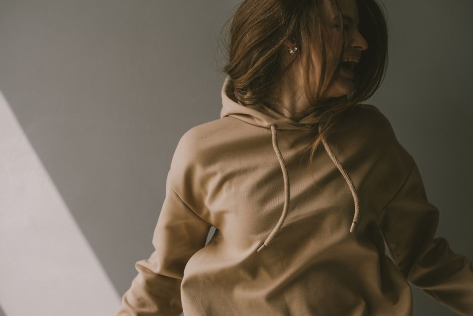
The strongest palette uses one light, two middle, and two dark shades
The most reliable neutral January color palette is not all beige. It is a five-color system that creates depth while keeping every piece easy to combine. Use the light shades near the face, the middle shades for the main garment, and the dark shades for shoes, bags, belts, or outerwear.
| Color | Best role | Camera advantage | Common mistake |
|---|---|---|---|
| Soft white | Top, scarf, or shirt | Brightens the face | Overexposure beside snow or pale walls |
| Oatmeal | Sweater or knit dress | Adds warmth without harsh contrast | Looks yellow when paired with warm lighting |
| Mushroom taupe | Trousers, skirt, or coat | Creates a quiet middle tone | Disappears against concrete or beige interiors |
| Charcoal | Coat, trousers, or boots | Defines the silhouette | Can look nearly black in shade |
| Ink navy | Scarf, denim, bag, or knitwear | Adds depth without the hardness of black | Turns blue under cool daylight |
Use the 60-30-10 balance
Let one neutral cover about 60 percent of the outfit, a second shade cover about 30 percent, and the darkest or most distinct shade cover about 10 percent. A mushroom coat, oatmeal knit, and ink-navy bag follow the rule without looking calculated.
This ratio also works for group photos. If several people wear neutrals, ask each person to choose a different dominant shade. One person can wear charcoal, another soft white, and another taupe. The group will look coordinated without blending into one gray mass.
Know when black is too strong
Black is useful when the background is pale, snowy, or strongly lit. It is less forgiving in a dark indoor room because it can erase garment detail. Ink navy, espresso, and deep olive often hold more visible texture while keeping the same grounding effect.
The clear winner for most January portraits is charcoal. It gives the outfit shape, shows more fabric detail than pure black, and works with both warm oatmeal and cool soft white.
Which neutral pieces earn their price?
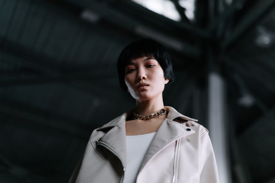
My strongest recommendation is to buy the coat before the luxury knit. The coat controls the largest visible area, sets the silhouette, and often appears in every outdoor image.
When not to buy the expensive version
Do not buy cashmere simply because the word sounds photogenic. Fine cashmere can look flat under direct light, pill with frequent wear, and lose its shape if the fit is too loose. Choose merino wool when you need a sharper outline, easier layering, and a lower maintenance burden.
Skip a very pale coat if you will photograph beside snow, white architecture, or a bright studio wall. It can disappear at the edges. Choose camel, taupe, or charcoal instead.
Bottom Line
For the best balance of visible texture, warmth, and repeat wear, choose a charcoal or camel coat first, then add one light merino layer and one dark accessory. The COS merino sweater is the most practical middle-layer pick; the Aritzia coat wins when the outer silhouette matters most.
What mistakes make neutral outfits photograph badly?

Why did my beige outfit disappear?
Usually, the outfit sits too close to the background in value. Move at least one piece two shades darker or lighter. A taupe coat against a beige wall needs a soft-white top or charcoal scarf to restore separation.
Why does white look harsh?
Pure white reflects more light than the camera can hold in a bright scene. Replace it with ivory, ecru, or pale stone, especially outdoors near snow. Keep the brightest white away from a sunlit window unless the photographer can control exposure.
Why does the outfit look more expensive in person than on screen?
Texture may be too subtle, the fit may lack structure, or every item may have the same visual weight. Add one defined edge: a lapel, ribbed collar, pleat, belt, or dark shoe. Avoid stacking five soft, oversized pieces together; the camera needs at least one clean line.
The final test takes ten seconds: photograph the outfit from several feet away, zoom out, and ask whether the face, silhouette, and darkest anchor remain clear. If they do, the palette is doing its job. If they do not, changing the shade relationship will help more than adding another accessory.
The single most important takeaway is this: a neutral January palette photographs best when soft white or oatmeal meets a distinct middle tone and one dark anchor with visible texture between them.